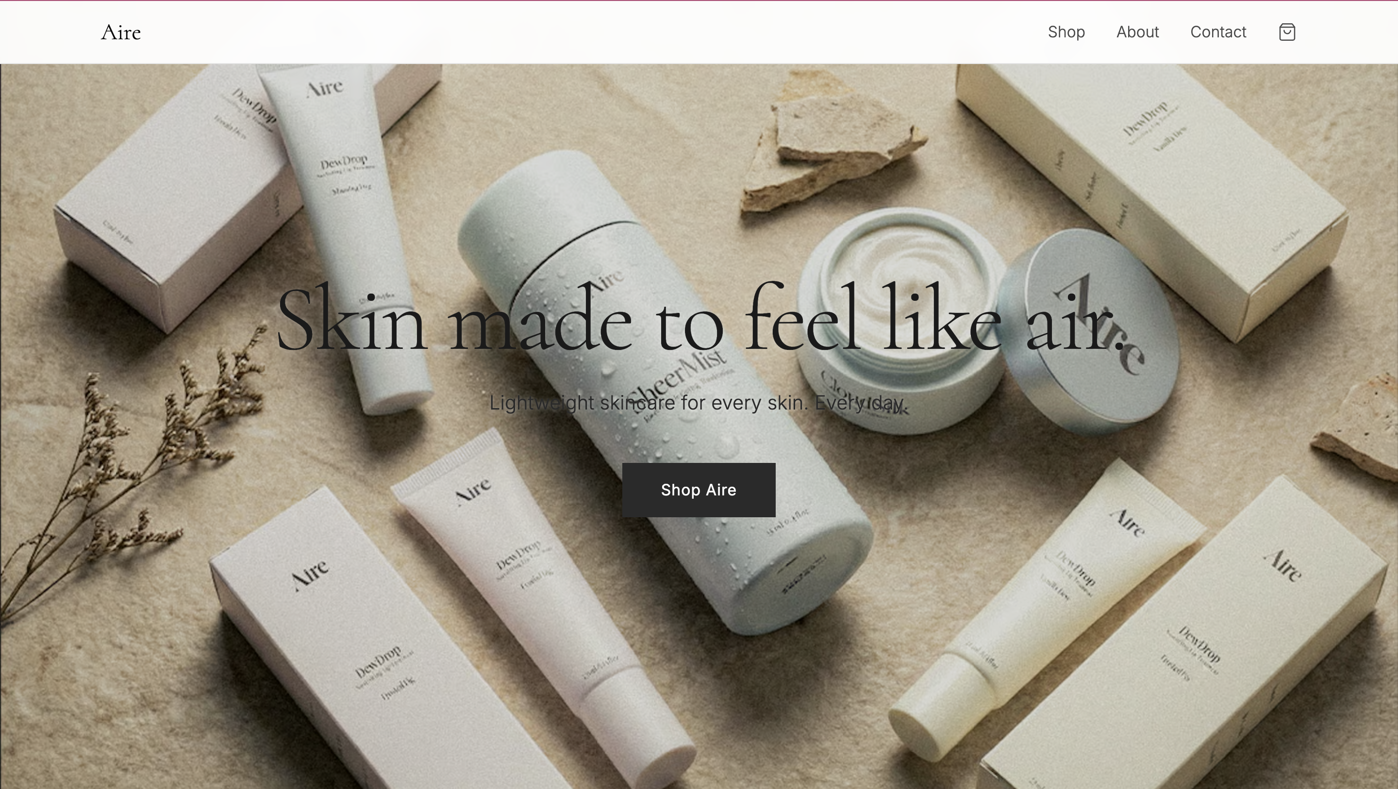
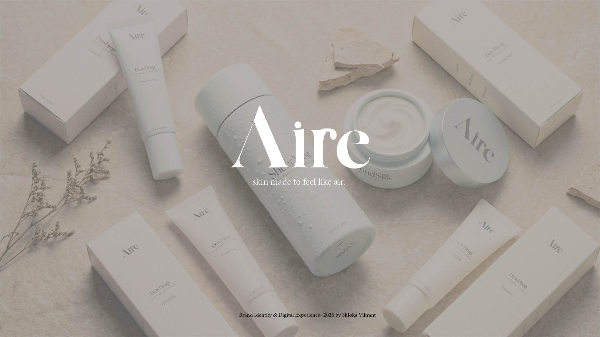
Aire
Skin made to feel like air.
Concept
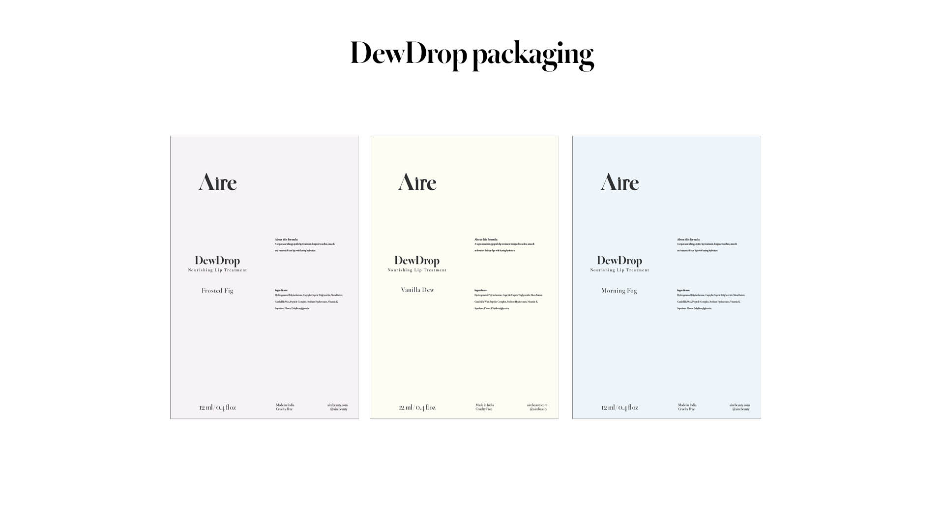
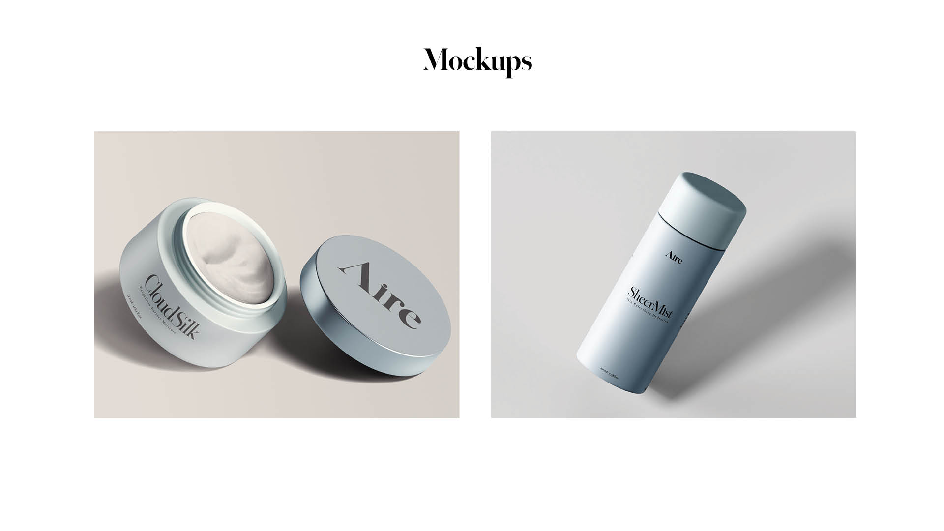
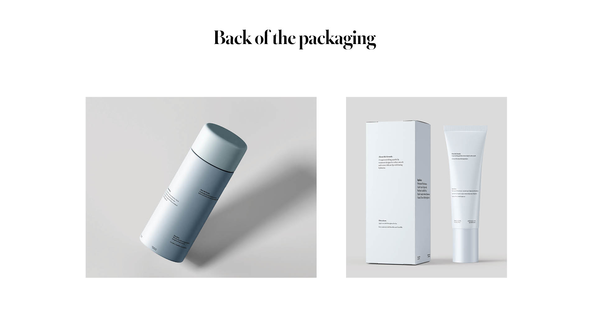
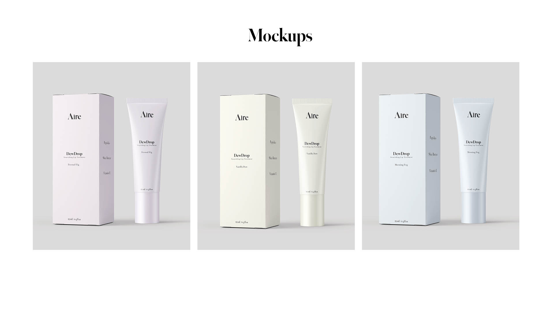
Aire is a minimalist skincare concept built around the feeling of weightlessness. The brand translates air into texture, mist, dew, silk. Each product represents a different state of lightness, designed to layer seamlessly without heaviness. The visual identity reflects this philosophy through softened neutrals, refined typography, and controlled spacing. Aire exists in the space between presence and absence, where skincare feels breathable, effortless, and elemental.
As the consumer progresses through the skincare routine, the packaging colour gradually becomes lighter. This visual transition reflects the sensation of the skin becoming clearer, softer, and lighter embodying the idea of becoming closer to “Aire”.
Design System
Made in Adobe InDesign

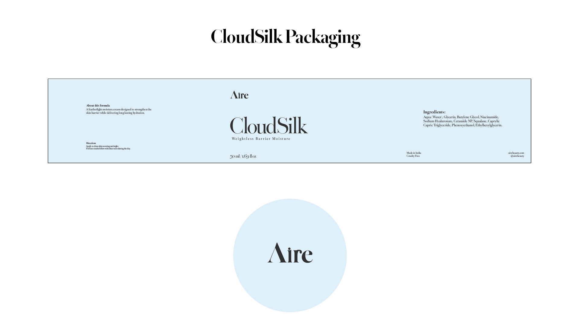
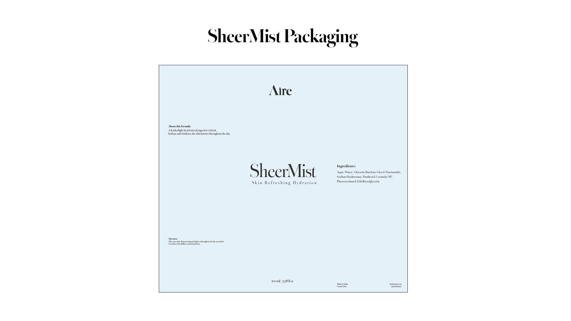
Packaging System
Made in Adobe Illustrator
Product Mockups
Made in Adobe Photoshop
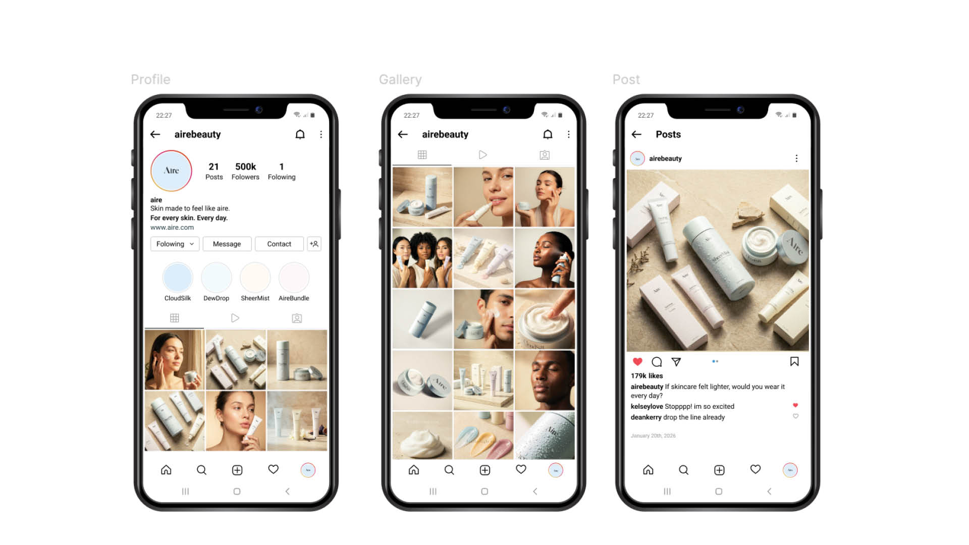
Social Media
Made in Figma
Website
Made in Figma